
.bridge.
Connecting riders and drivers headed in same direction. How do you commute?
A five day interface design assignment which focused on designing an android app for car sharing which is powered by realtime data and availability.
Project Interface Design
Duration: 5 days
Role: UI/UX Designer

Problem Statment
How might we connect people traveling in the same direction on a common route, share a cost, get comfortable and reach their work place faster than public transportation methods?

RESEARCH
User Interview + Identifying User needs
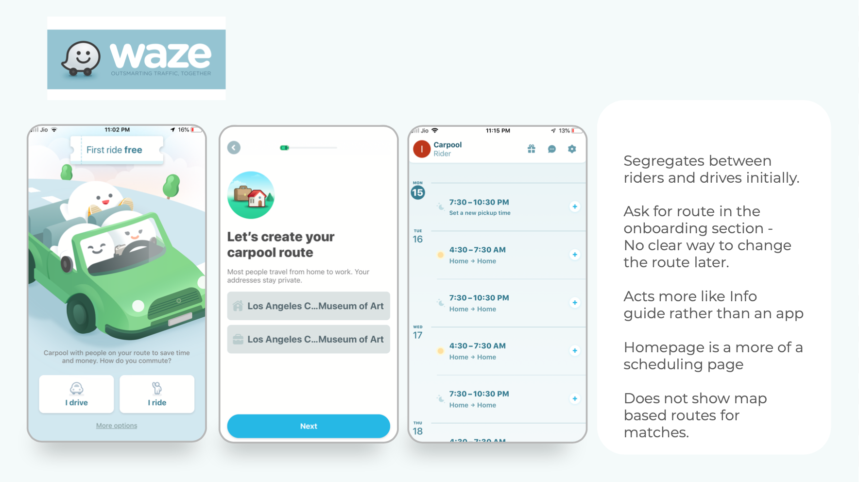
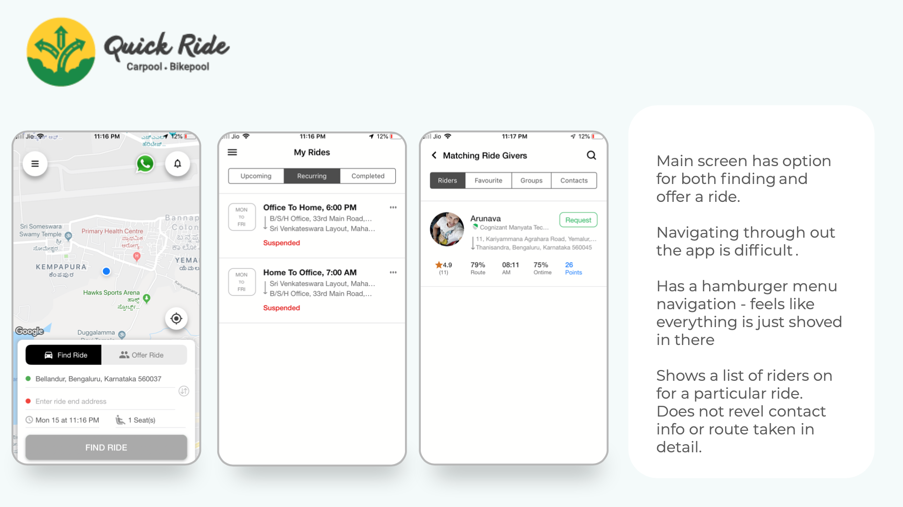
Competitive Analysis
I filtered through some secondary research sources and settled on some major resources with some credible insight. I focused on things such as accessibility, functionality and usability. I looked at specific elements on each, such as how They approach services appointment and information.


User Persons
What types of users are going to benefit from this solution? I wanted to embody different types of users, such different types of riders and drives.

User Journeys
Created user journeys to see where the biggest opportunity space is and what are the missing spaces within the current service that need to be improved.


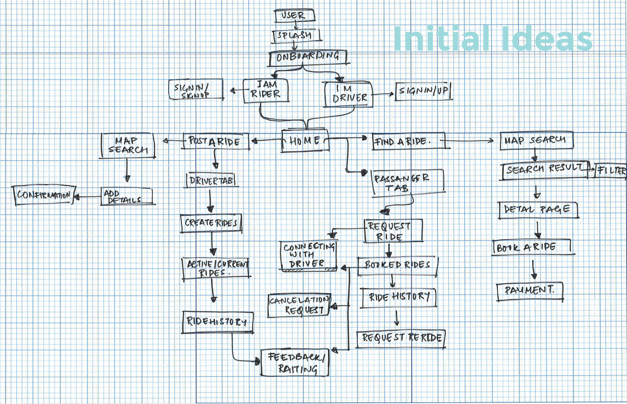
IDEATION
Mind Mapping
This brainstorming process allowed me to quickly map out all aspects of the app flow from both drivers and riders. From here I was able to categorize the clusters and build in an INFORMATION ARCHITECTURE for the platform.

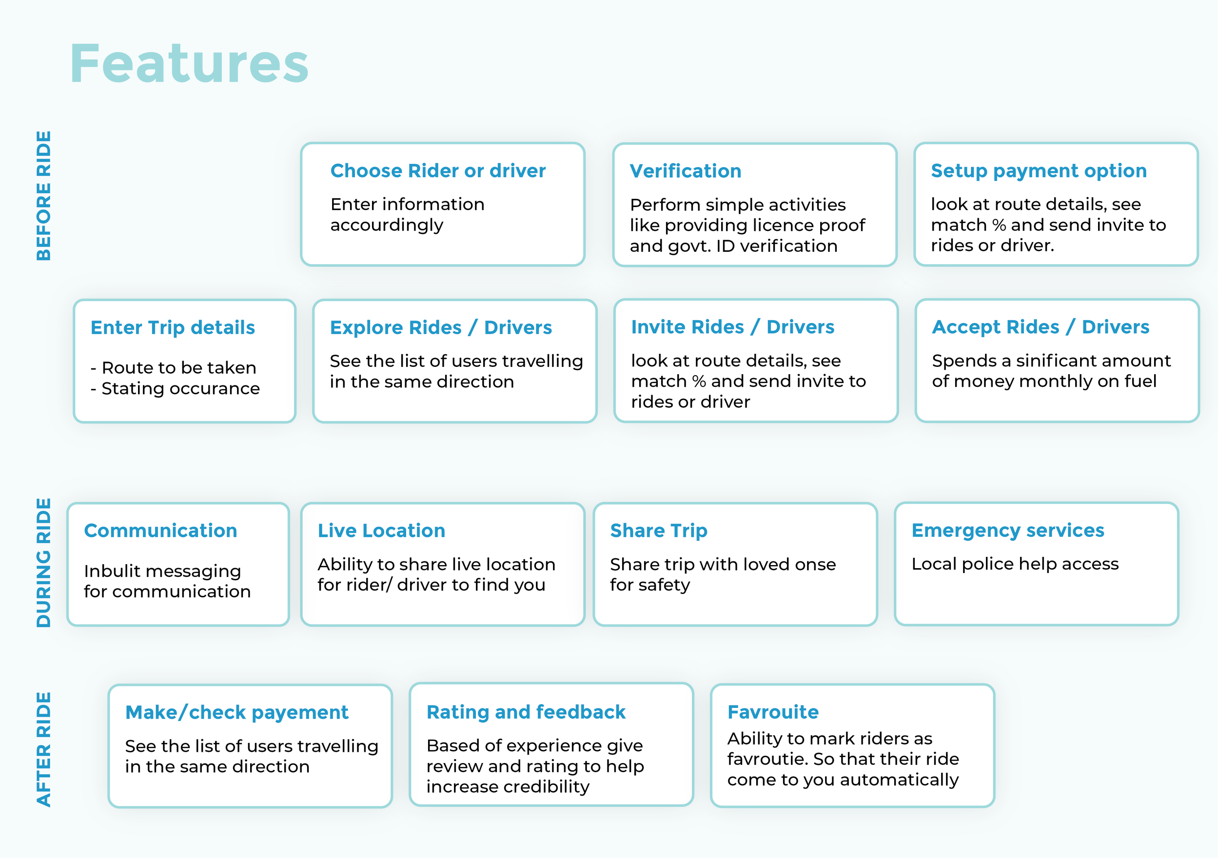
SOLUTION
Low -Fi Screens
I started with hand sketching some rough ideas of what users would like to see in a potential solution. After reviewing the sketch and flows, I moved them over to sketch and organized the flows of clarity.

Mid - Fi Screens
I began to digitize all of my low - fidelity flows and design further providing a larger scope of the functionality of my app.

Prototype

On - boarding and Signup
Shows the details of choosing between rider and driver
along with telling basics about the app.

Finding a Ride
Using Bridge one can look for curated options that match your route the maximum. Both rider and driver’s flow steps almost feel similar.
Map based result exploration is the key. The rider is notified with every option on the walk time and the pick up and drop off details.

Switch to Driver
Hamburger menu - gives access to switch between driver and rider if one person is wanting to do both the tasks.
Also gives users access to all the necessary options like Ride history, Referrals, Profile, Payment and help center.
User Testing
I was given the opportunity to user test with 4 users. They provided me with insights on what to change and improve from Mid Fidelity Mockup to the final. Some of the Insights were


